Category Archives: branding

Taking a step back to take a step forward

Are we as designers now depending on using a computer to do the work for us?

As a team in the studio we often have discussions on how we can give a greater service to our clients, how we can make life ‘easier’ and more productive between the clients and us. One of the issues we seem to come across quite often is portraying our ideas over to the client using scamps.

In previous jobs we have only supplied simple line drawings accompanied with a blurb about what our ideas are. Yes, this sometimes gets agreed first time, with the client getting the ‘idea’ straight away, but often the process takes longer than it really should. Once the idea is approved the client will often not see what the advert or campaign will really look like until the final piece, thus meaning the client could feel unsatisfied and the process may have to start again.

Our idea was to take a step back from the computer, and to create a personal hand drawn, finished scamp (as seen in the image below) using colour and detail, so that the client would get a real image of what the final piece would look like.

Scamping in progress

Using this technique is helping the process from getting the initial idea to the client, to the final piece, easier. The client is happy as they can see we are putting the effort in straight away from the initial ideas, and for our benefit we now have finished scamps that we can take to show potential new clients how hard we work for our current ones.

Final piece

2 Comments

Filed under art direction, branding, graphic design, logos, Presentation, Scamp, Uncategorized

The real world but not as we know it…..

The real world, but not as we know it. The film industry has a great influx of new digitally mastered films, with the likes of Transformers being a massive hit. There are more masterpieces in production, so I thought I would examine a few, that I think look amazing.

Tron: Legacy

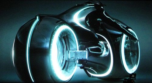
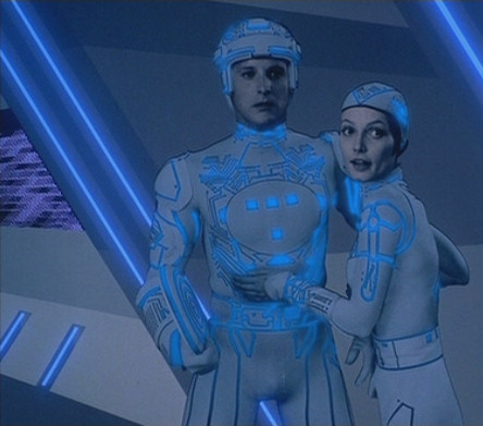
Tron Legacy is a contemporary version of the ’80 cult classic’. The Big wigs in Hollywood have now made a more slick and finished version and it looks awesome. I’m not too sure of the plot, but as you can see from the trailer, the graphics will definitely impress.

tron_legacy-2

TRON LEGACY

THE ORGINAL TRON

THE ORIGINAL TRON

Alice in Wonderland

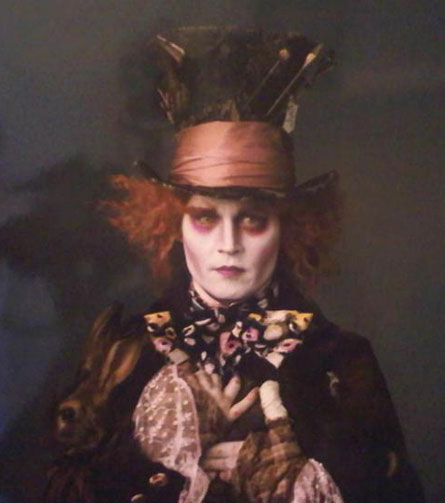
The genius that is Tim Burton has re-made this Disney classic. It follows the familiar, weird, and wonderfull style of other Tim Burton films i.e. Beatlejuice? If you’re looking for an all round ‘realistic but surreal’ graphic set-up then this is one to see.

JOHNNY DEPP AS THE MAD HATTER

JOHNNY DEPP AS THE MAD HATTER

There is news of a new Toy Story film coming out early next year, so let’s hope it gets here sooner rather than later.

1 Comment

Filed under branding, graphic design, Uncategorized, Video

Does Twitter have a true identity?

As I mentioned in a previous blog, Twitter recently changed it’s own branding…
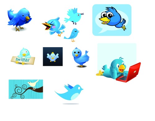
However when I searched for new the Twitter branding, I found that everyone seems to have there own various of the Twitter bird? Why is this? Is this good for the brand? Below are a few examples I thought you could look at……

Twitter bird

3 Comments

Filed under branding, social media

The Beauty of Branding

At Big Cat Idea, we are often asked what is it that makes a great logo? The answer can often be very difficult as it is due to personal likes and dislikes.
There are some cool sites out, which talk about the beauty of the logo. So I thought I would take some time out to show these site and explain what they do.

Logo Lounge: Explains the current trends in logos, and has some nice examples of how these trends are being executed.

Just Creative: Nice blogging site, which is really informative about the world of design, the link, has nice example of ‘What makes a good logo?’

Graphic design blog: Looking for a weird or playful logo? Check this site out, there are some nice examples on this site spend some time on these, they are very clever!

Graphic design blog: Again this blog come up trumps! This time it explains certain logos that have hidden messages. This is cool.

Spyrestudios: A nice site to get inspiration from. You can get an idea for a logo from anywhere! Urban typography is the key here.

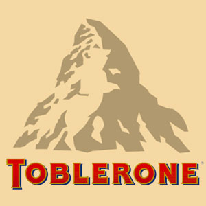
TobleroneToblerone is a logo that I recently discovered has a symbolic image, can you see what it is? it is really cool once you figure out what it is.
I hope this has helped, I certainly enjoyed looking at all the links myself have fun.

8 Comments

Filed under branding, graphic design, logos

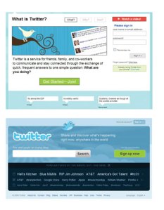
Is twitter going in the right direction with it’s new branding?

I have recently noticed that twitter have a new brand to go with it’s home page.

In my opinion they seem to be going in the right direction. They no longer have a simple stock shot to represent it’s almost ‘cult’ following, it now has it’s own voice, ‘so to say’. The new twitter bird is quirky and cool and sits well on the beautifully designed background, it is a fun and engaging homepage that suits the masses of the different backgrounds we all have on our own profiles.

Mashable go indepth on this subject and it is worth a read. twitter

Twitter has become a world wide brand that reaches out to a huge audience, which has never happened before with the likes of Facebook, Bebo and Myspace.

With this new branding element, it shows that they are putting in the effort to keep it that way. As the mashable link says, Twitter was originally just to show your friends what you were up to, it is now a tool that can be used for business, pleasure and lots more!

1 Comment

Filed under branding, graphic design, logos